Overland Partners Headquarters | Hughes Warehouse
San Antonio, Texas, USA
Transformation: Reflecting the sustainability tent at the heart of our firm culture, revitalizing a city block and casting a vision for the future.
AIA Committee on the Environment (COTE®) Top Ten Award (2015)
Client
Project Size
Completed in
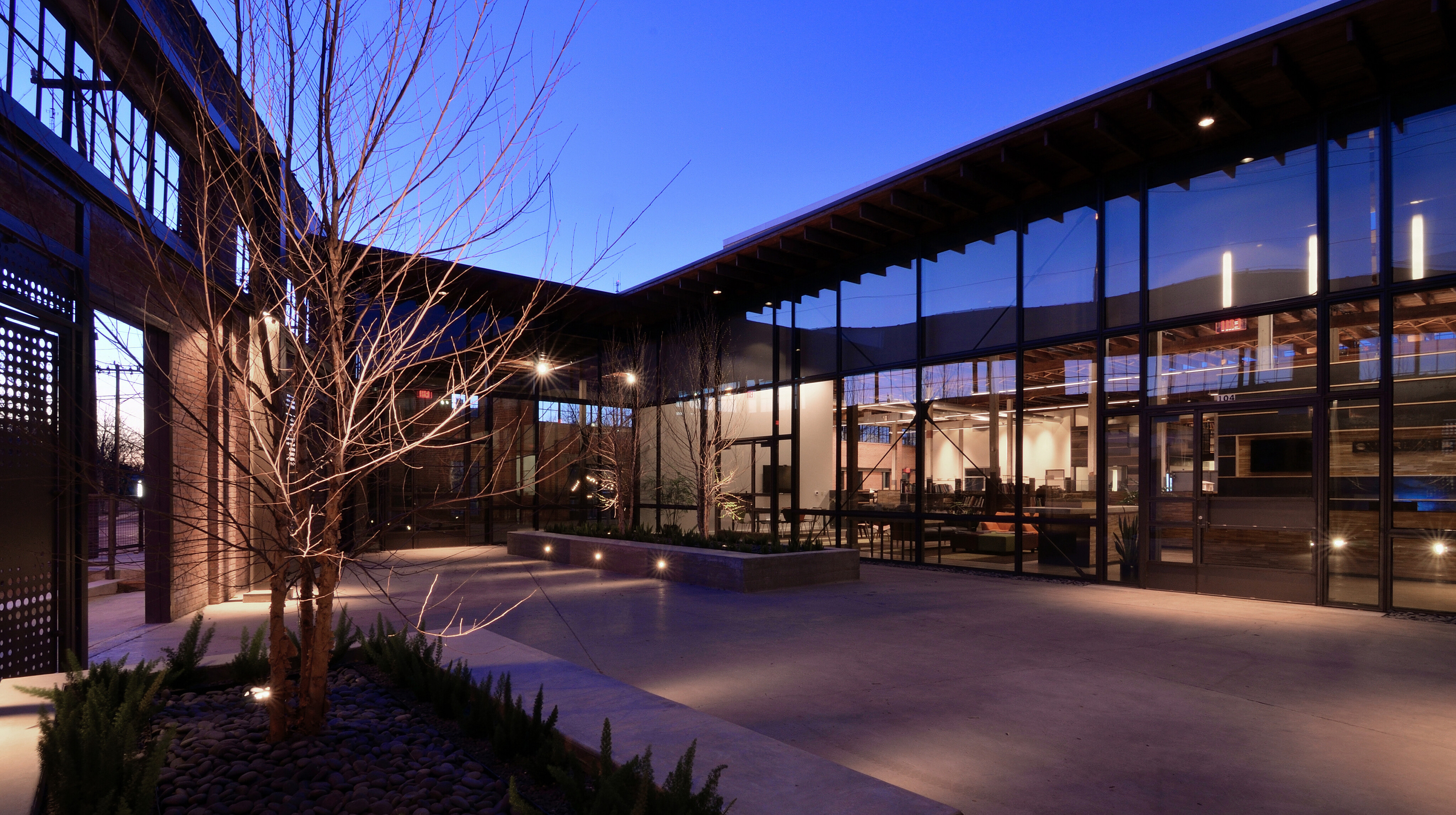
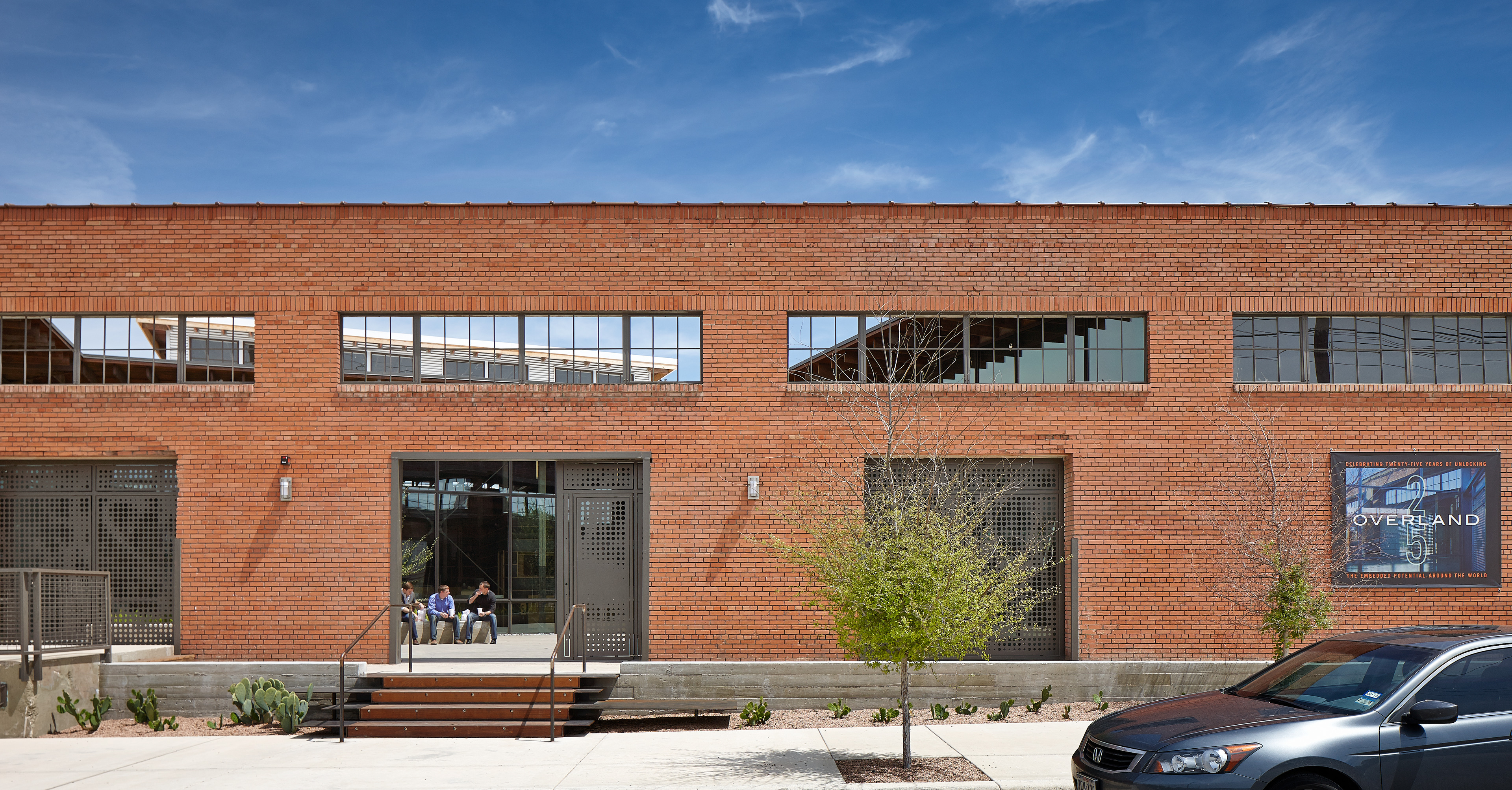
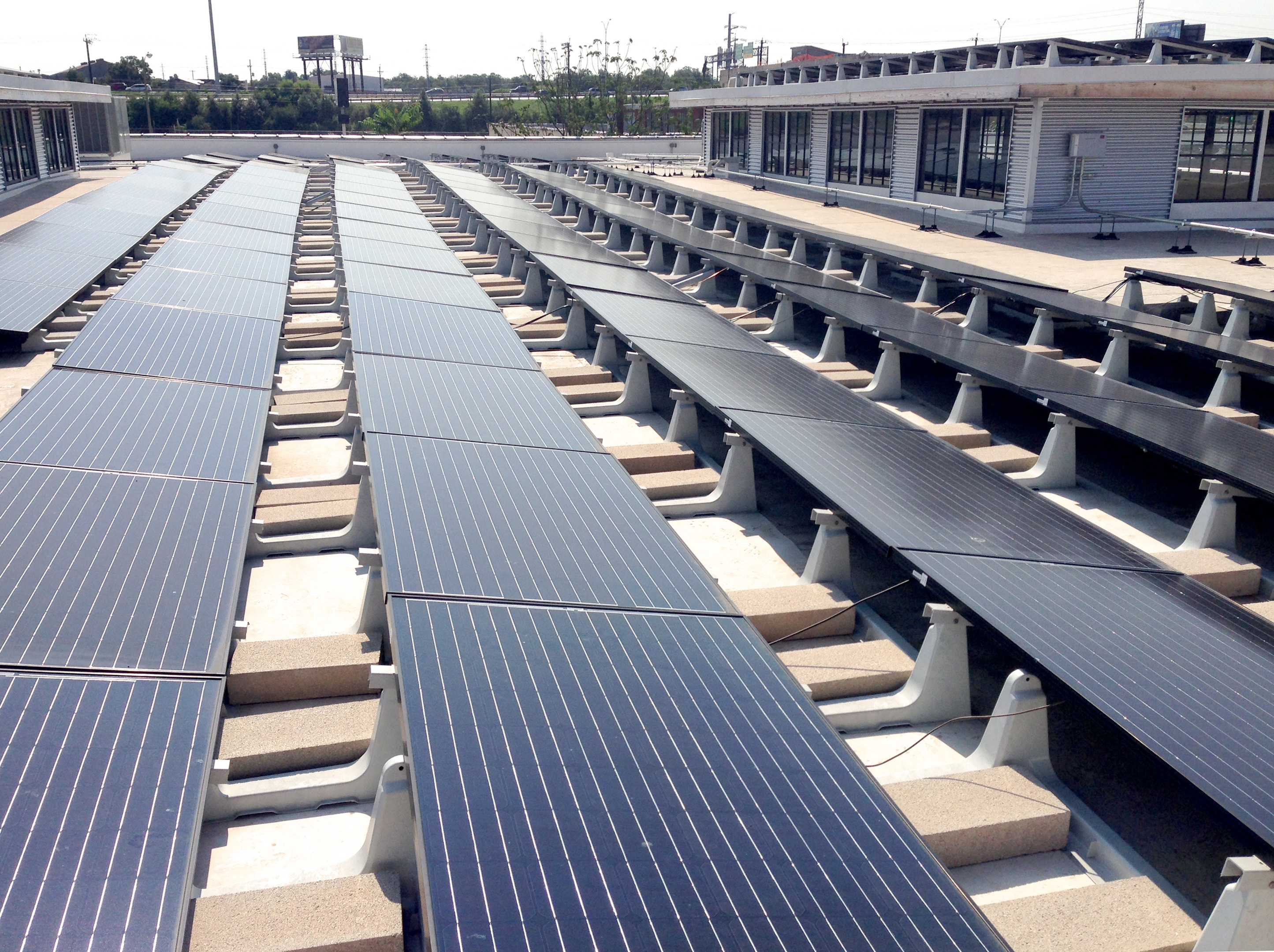
In the heart of San Antonio’s burgeoning revitalization, Overland embarked on a mission to not only design a cutting-edge office space but to elevate the tenor of development of an entire city block, casting a bold vision for the future. By repurposing the 1917 Hughes Plumbing Warehouse, we transformed a forgotten piece of history into a thriving neighborhood amenity, preserving its industrial character while introducing contemporary elements. Our innovative design seamlessly integrates old and new, creating a dynamic workspace that fosters creativity and collaboration. Through meticulous attention to detail and sophisticated systems that optimize the building’s performance, we achieved remarkable sustainability goals, repurposing materials, reducing energy consumption and maximizing efficiency. Embracing the industrial aesthetic of the street, we preserved original features while introducing modern steel and glass elements. The addition of a shared courtyard, reclaimed materials, and high-tech systems further enhance the building’s functionality and aesthetic appeal. Today, the Hughes Warehouse stands as a beacon of urban renewal, attracting city leaders, artists, and citizens alike to its vibrant community hub.
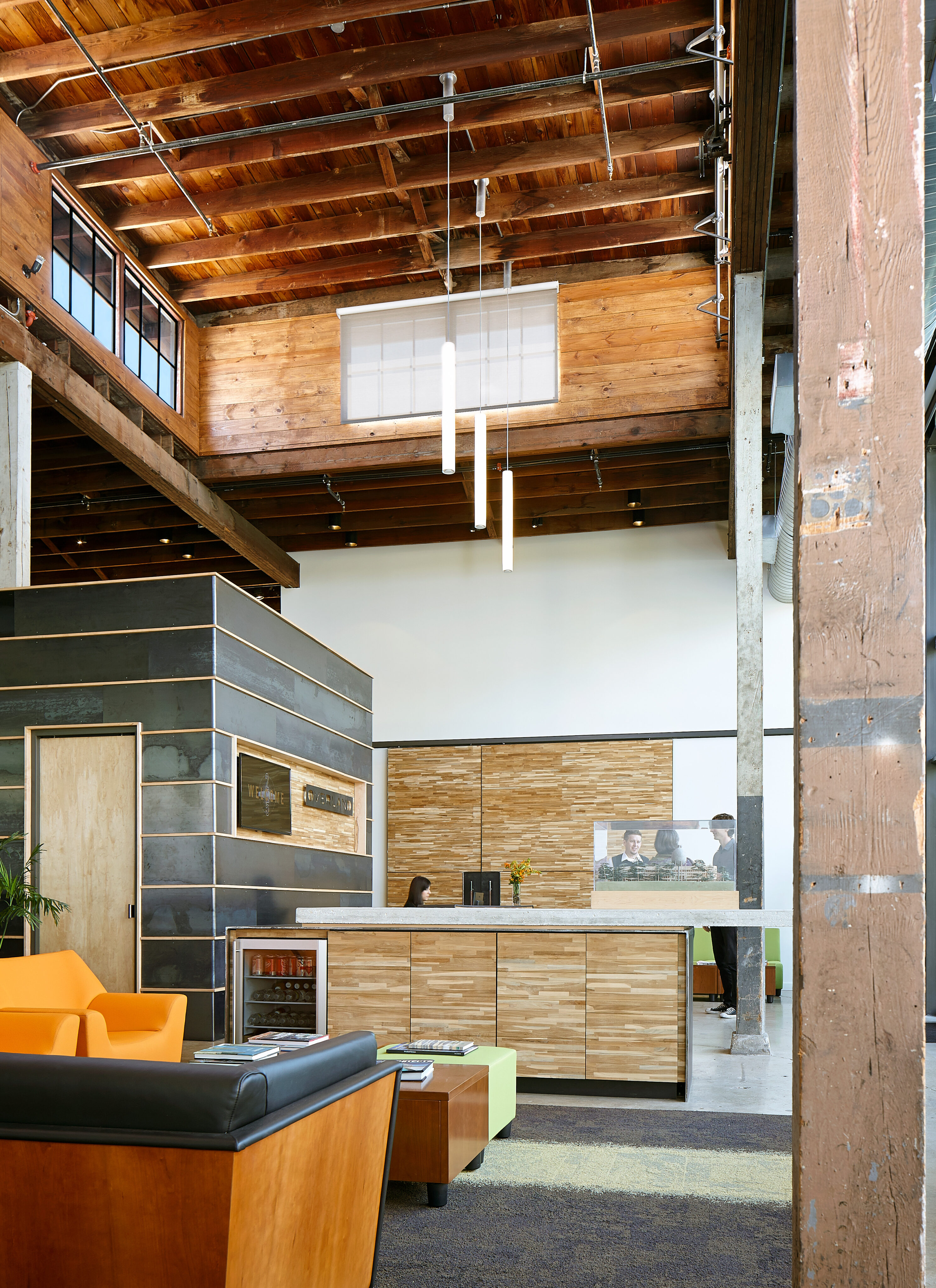
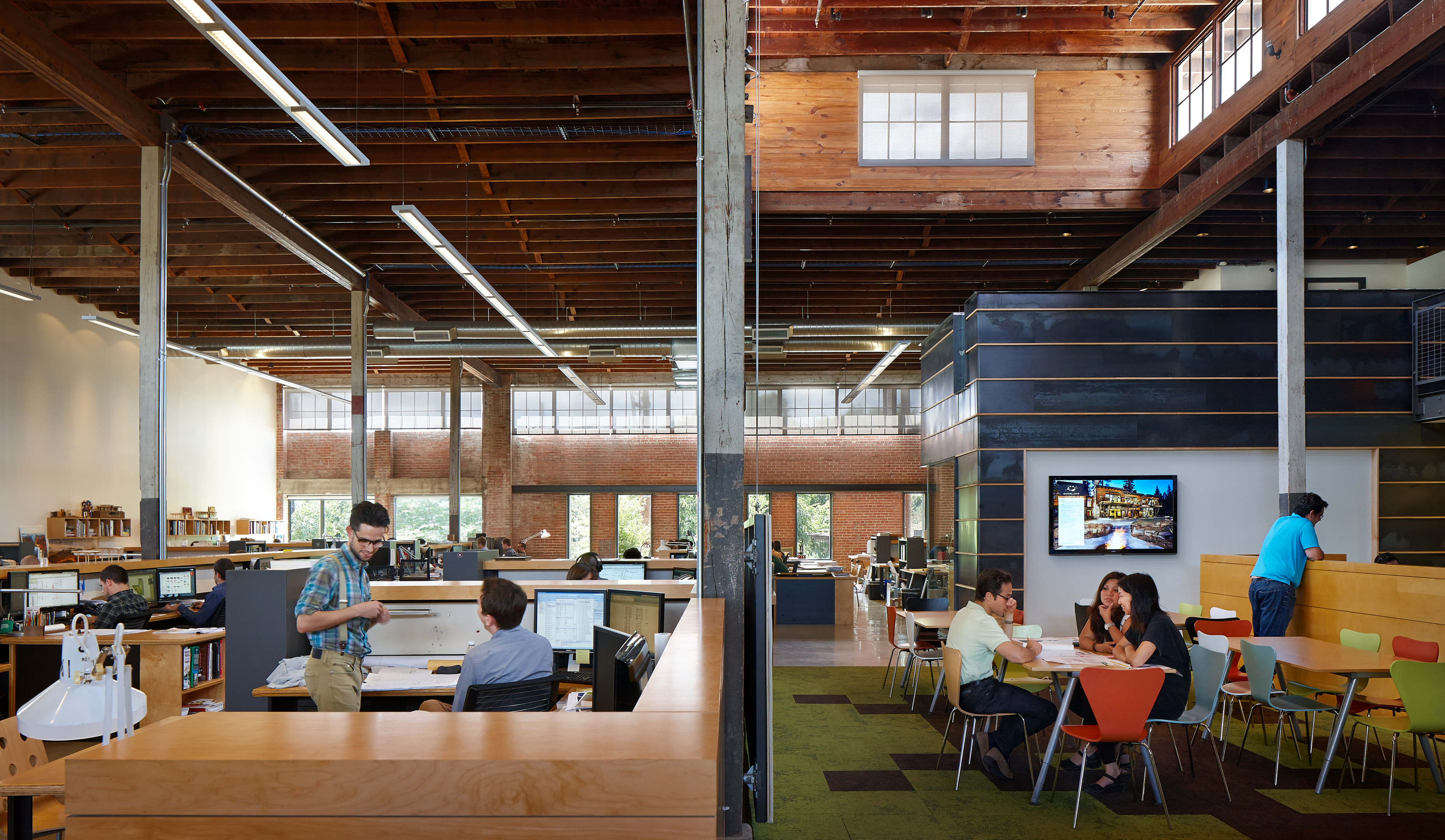
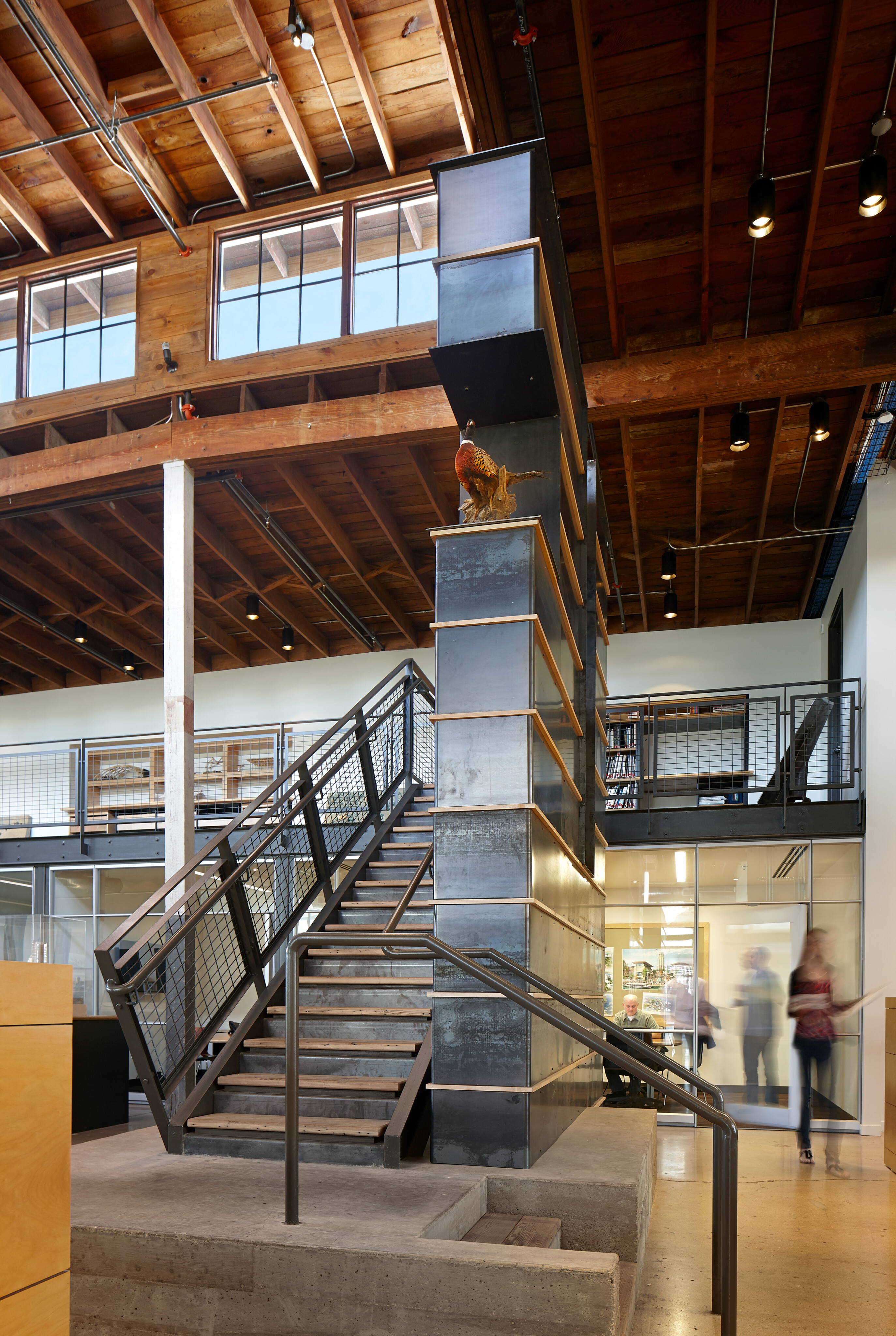
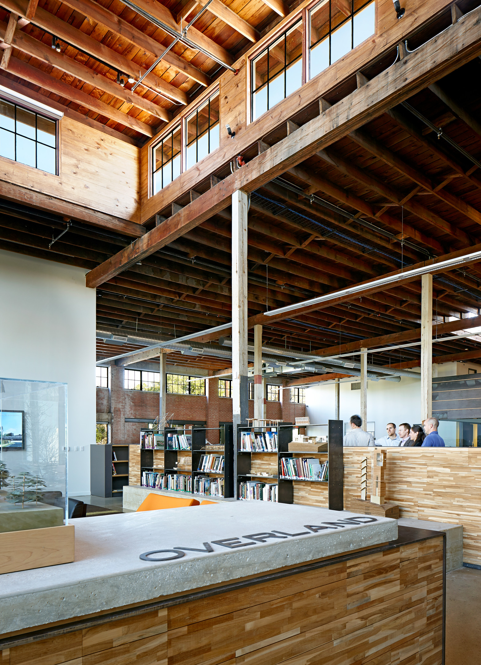
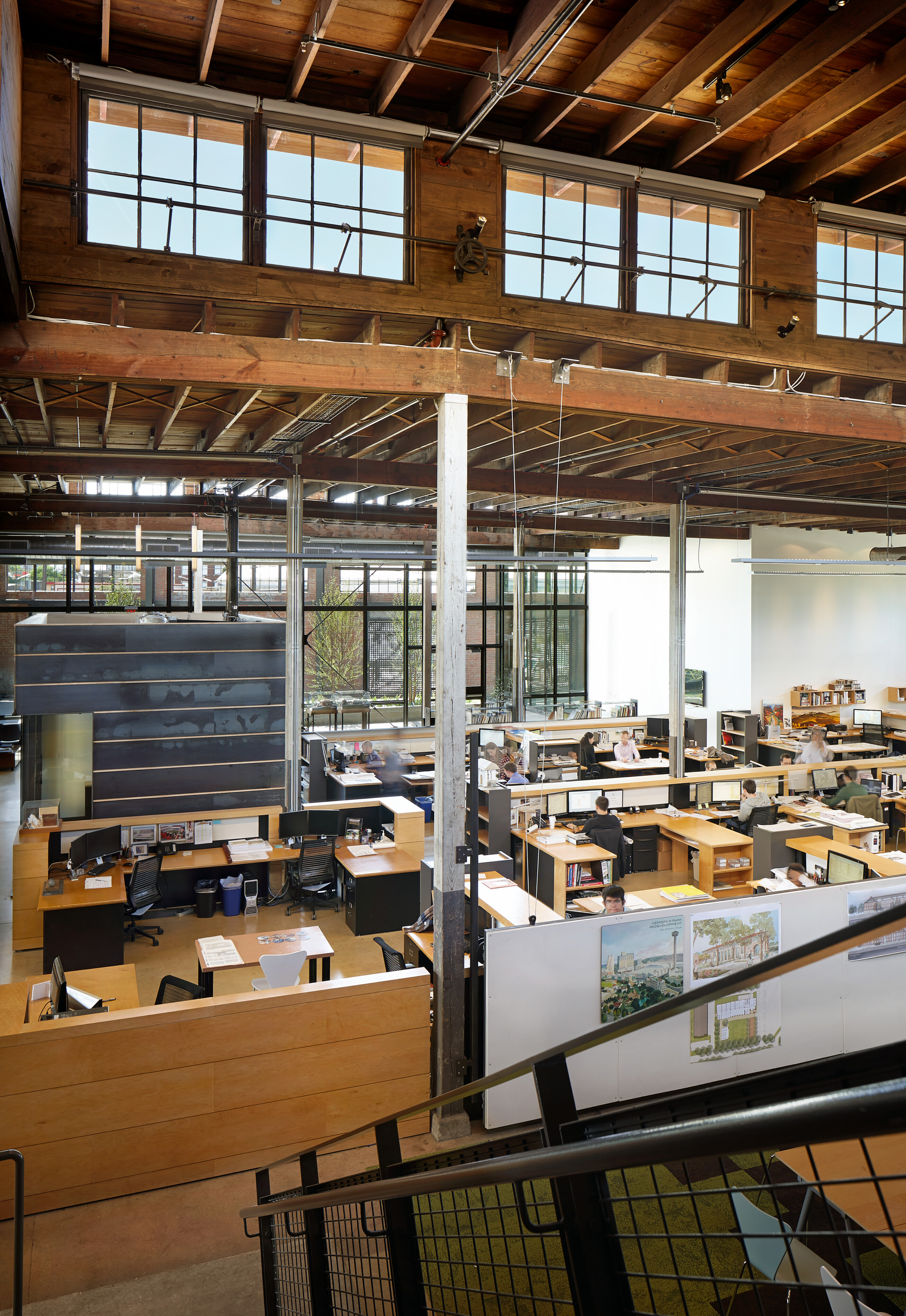
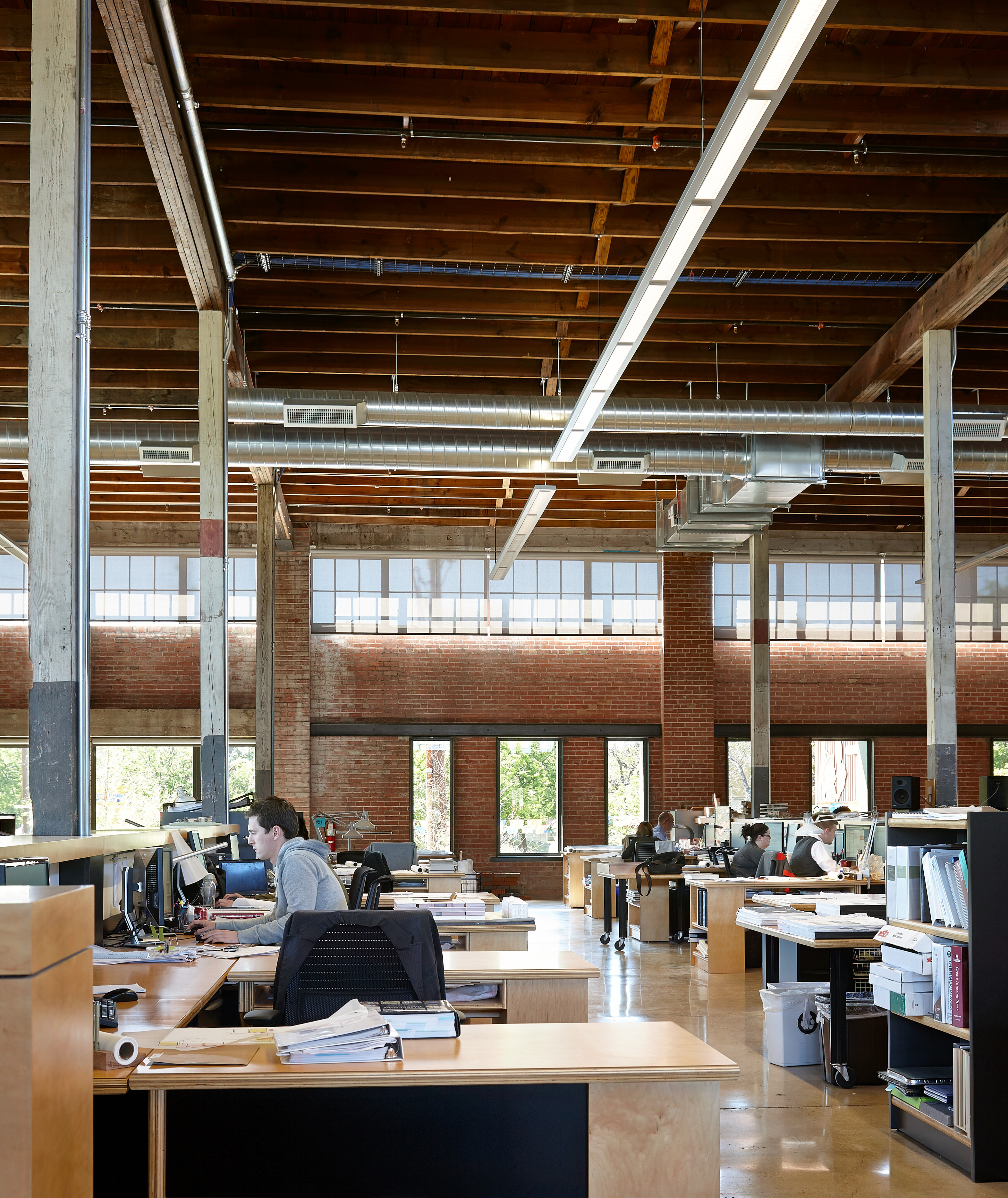
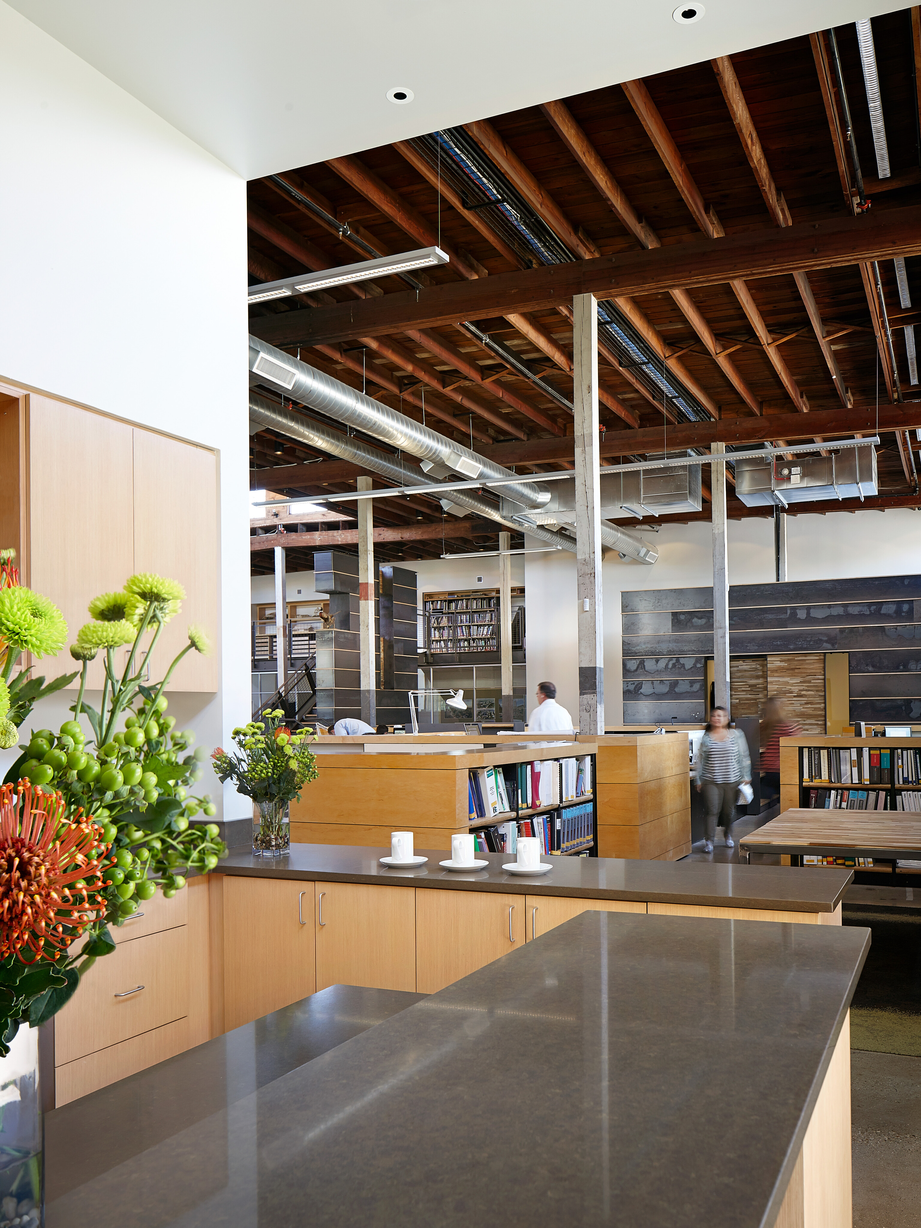
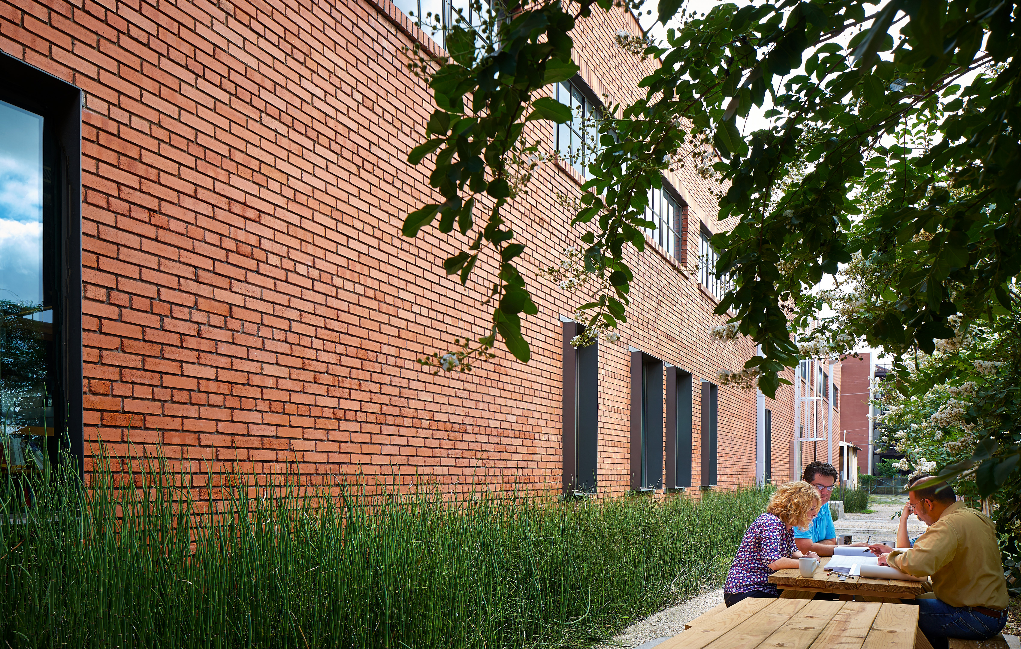
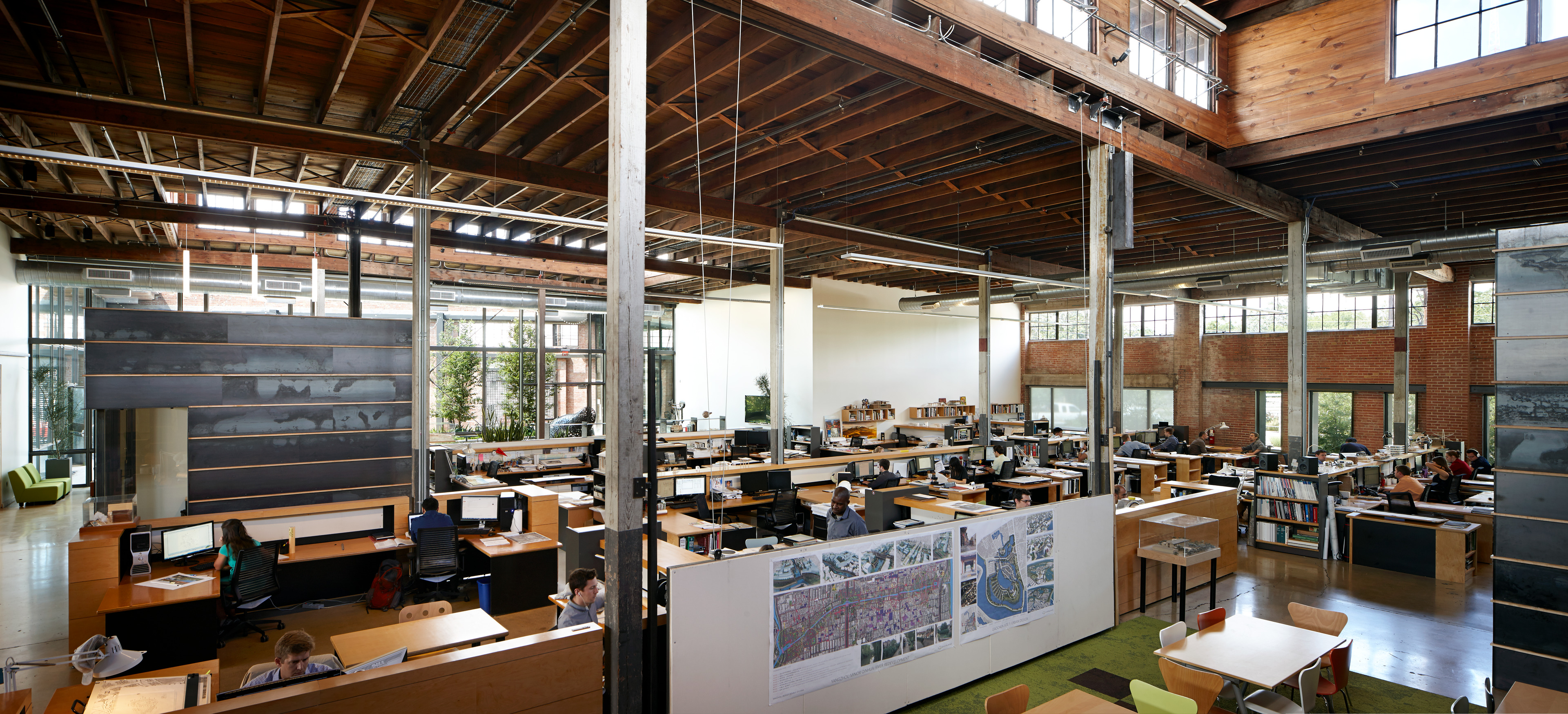
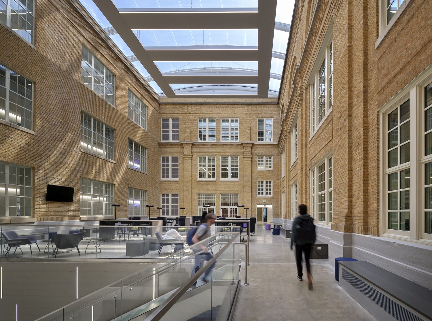
In keeping with the industrial aesthetic of the street, Overland preserved the brick and wood elements of the warehouse, as well as the concrete floors. The design team wanted to celebrate the raw nature of the space, while clearly communicating the atmosphere of a twenty-first century workplace.
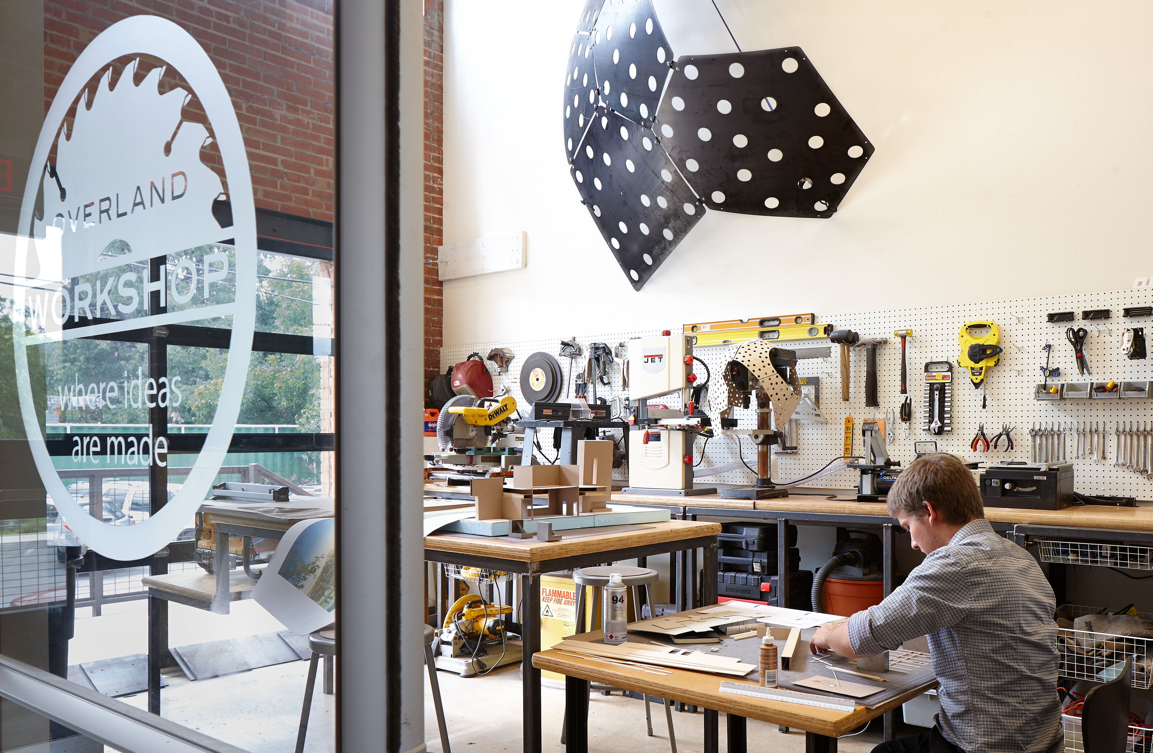
The open format allows light and ideas to flow freely across desks and aisles. Overland decided to reduce individual desk space in favor of public and meeting spaces of various sizes and privacy. These inspiring and versatile spaces encourage idea-sharing and collaboration to drive creativity on every level.
A very successful example of a creative, low-cost adaptive reuse project that maintains the integrity and the character of the building. Introduction of contemporary structural, electrical, and mechanical systems was done in such a way as to not detract from the historic elements of the building. This proves that making use of a high percentage of reused and repurposed materials can be done creatively and affordably.
AIA COTE® Award Juror
Awards
2016 Chicago Athenaeum Green Good Design Award
2015 AIA COTE® Top Ten Award
2015 SA Tomorrow Sustainability Award
2014 Texas Society of Architects Design Award
2014 AIA San Antonio COTE® Award
2014 AIA San Antonio Design Merit Award
2014 Centro San Antonio Best of Downtown Awards – Best of Greater Downtown
2013 Power of Preservation Foundation Adaptive Reuse Award
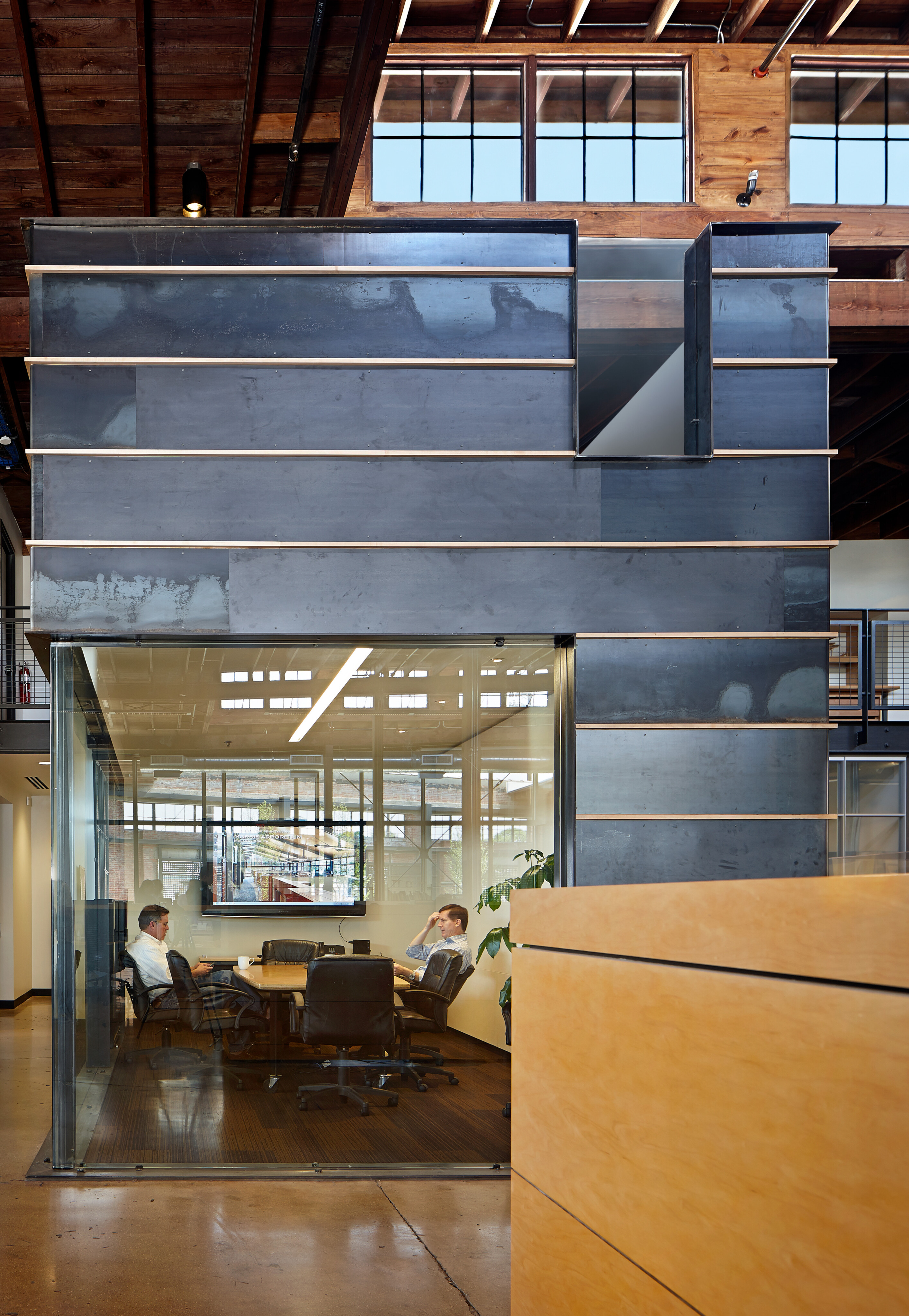
It’s a good balance between preserving the gritty industrial integrity of the building, but also making it clean and sophisticated. All the new insertions are steel and glass so there’s a clear distinction between old and new.
Overland Partners
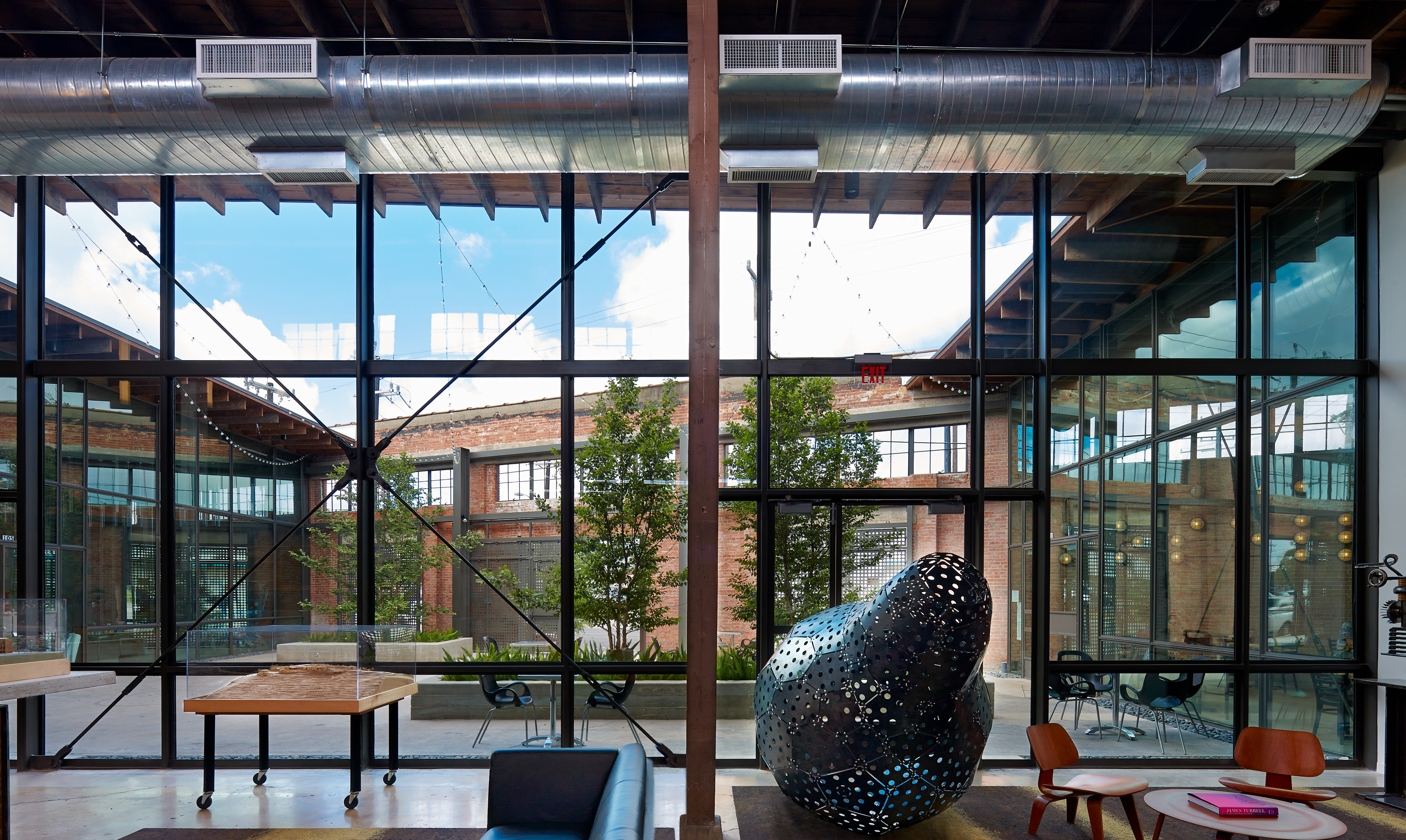
The new elements of the design are primarily steel and glass, a clear juxtaposition of old and new. To bring in light to the formerly windowless space, Overland boldly proposed peeling back 1,200 square feet of roof to create a courtyard to be shared by the building’s tenants. The developer’s initial hesitation at losing leasable space was overcome by the significant value added by the common space, which has been used for live music, art exhibitions, and meetings.
73%
34%
90%
48%
80%
Satisfaction Rate
Let’s design a greener future together.
